Storytelling for the Next Wave of Ocean Conservationists 
Ocean.org 
About The Client 
Ocean.org is the Vancouver Aquarium's parent brand of all things ocean conservation
Project Brief 
To build a sustainable content platform that engages ocean conservationists on a global level
Business Impact 
An award-winning storytelling framework that’s easy to use and can be set up for UGC
User Impact 
Entertaining, educational bite-sized content that brings awareness to and encourages ocean conservation
My Role 
Interactive Designer
The purpose of Ocean.org is to unite all of the Vancouver Aquarium's educational, research-based programs under one umbrella by showcasing stories of all the people, animals, and ecosystems that are a part of their explorations and discoveries.
The goal for Ocean.org is to be the resource and content hub for younger audiences to help them discover what they are passionate about in the realm of conservation and encourage them to take action in creating better, healthier oceans. The big opportunity here was that they didn't want to be just a blog or another a news site; they wanted to go beyond those paradigms and be adaptive enough to roll with the social media tides, whatever those would be in two, five, and ten years from now.
As a result, we designed a mobile-first, flexible content-building framework so that any content creator– whether they're a scuba diver, fishmonger, surfer, or shark-enthusiast– is able to post their story with ease (FYI, this was before Instagram Stories took off).
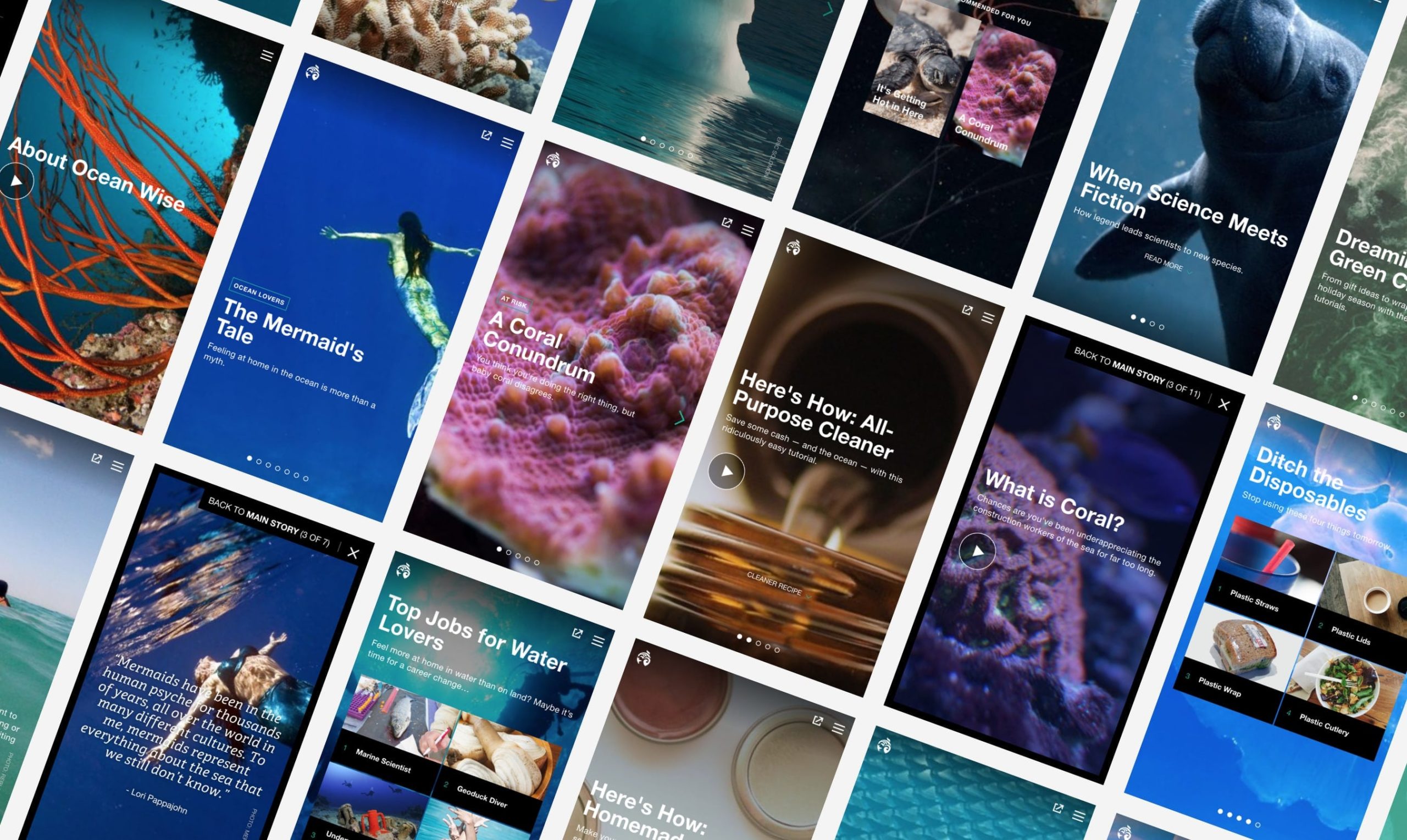
The Ocean has Many Stories to Tell 
Panel Types 
"Panels" are individual screens that are combined to make up a "story". Here are the different types that content creators can choose from:
• Image with short description
• Pull quote (image optional)
• Long-form text
• Interactive quiz
• Video with optional description
• List (visual or text-only)
• Call-to-action
We developed a flexible and socially-digestible content framework in WordPress called "stories". A story is built using "panels", which are made up of a combination of words, images, videos, and/or interactive elements. Together, these panels either weave into one cohesive narrative or illustrate a prevailing topic or theme.
Alone, an individual panel serves as a shareable moment (e.g. think an insightful quote or a compelling image) for any social media platform, acting as a gateway link for new audiences to participate in the bigger Ocean.org parent narrative. Longform content can also be tucked away, especially if there was more to learn; these are referred to as "deep dives". This allows the system to be adaptable and exploratory enough to provide both a linear and divergent narrative experience.
Whether stories are data-rich and educational, or purely for entertainment, they all end with calls-to-action. They can come in the forms of: asking users to donate to an animal rescue, inspiring them to lead a beach cleanup or having them sign a pledge to only eat sustainable seafood. The hope is that we turn curious readers into ocean advocates and environmental changemakers that take action at scales, small and large.
Diving Into Design 
Accolades 
• RGD So(cial) Good Design Award 2018: Non-Profit Winner
• Fast Company World Changing Ideas Awards 2018: Photo and Visualization Finalist
• Vancouver UX Awards 2017: UX for Good Finalist
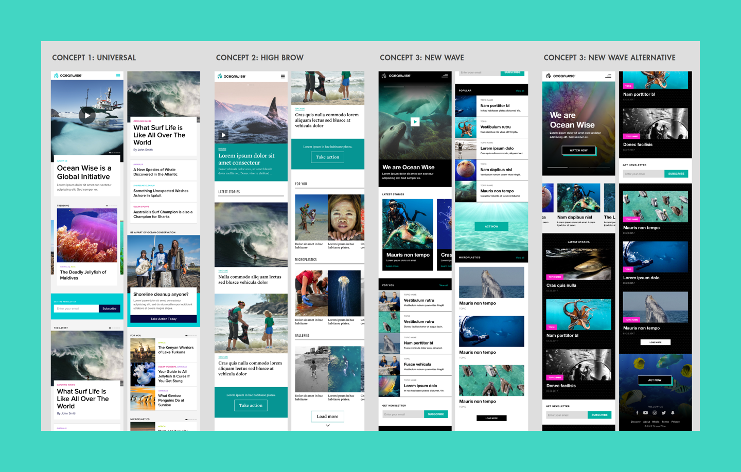
We adapted and built upon their brand identity into a digital design system to support all the content we envisioned having. Above, are the editorial UI concepts that we played with. These were inspired by "influential" content sites like Wired, Buzzfeed, Vice, The Outline, and National Geographic. We focused on the sites that our target audience would go to for parallel topics that were inline with what Ocean.org wanted to address.
Through a client workshop, we developed a set of principles that helped us refine the design we see today:
- One Image to Rule Them All
 – To make it easier for content creators, we designed it so that they only had to provide one image per panel. This means that the main subject matter of a photo is always optimized and in focus despite the device size and state that the image is appearing in.
 - Optimized Legibility for Scannability
 – Hierarchy between type elements was highly contrasted through size, weight, and sometimes colour. We wanted headlines and titles to be concise and punchy, CTAs to use a consistent design pattern, and scrims placed on every image to ensure text is readable no matter what.
 - Motion & Micro-interactions as Guides ↔️ – We wanted an app-like experience within a website, so we provided friendly animations throughout the UI as "nudges" that made it easier for users to navigate this novel (at the time) way of consuming information.
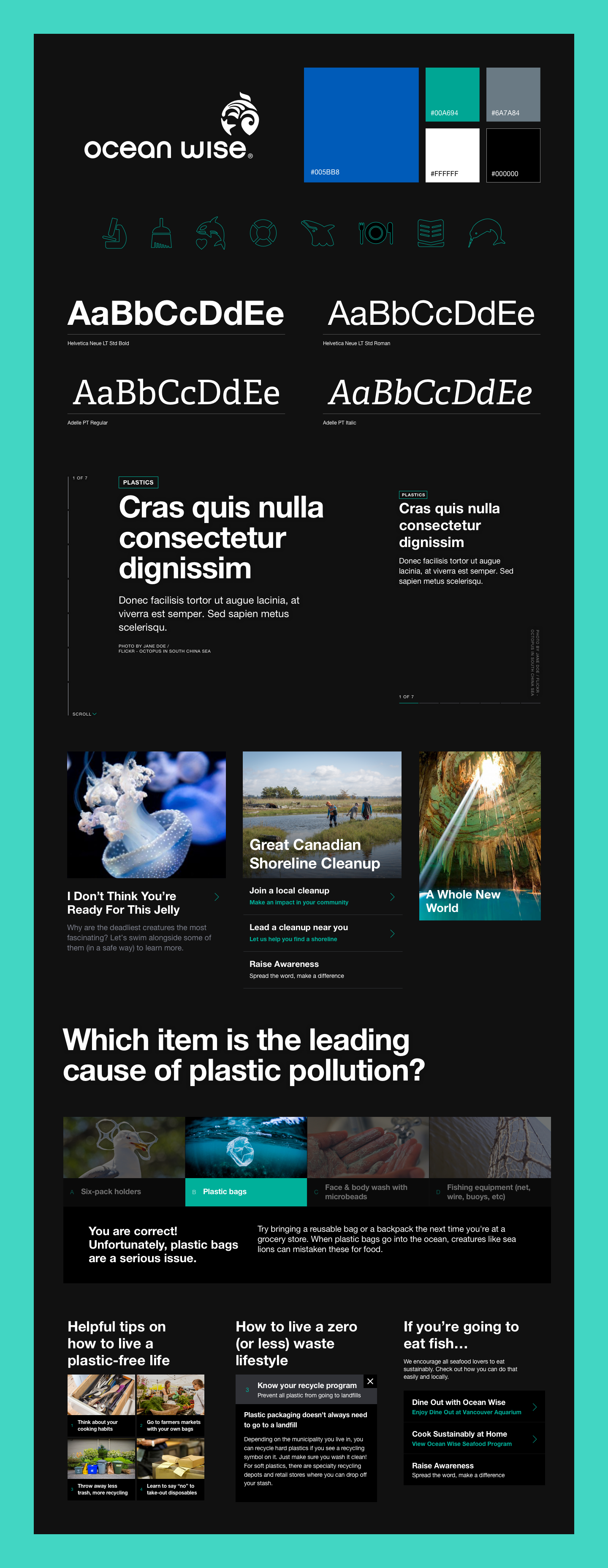
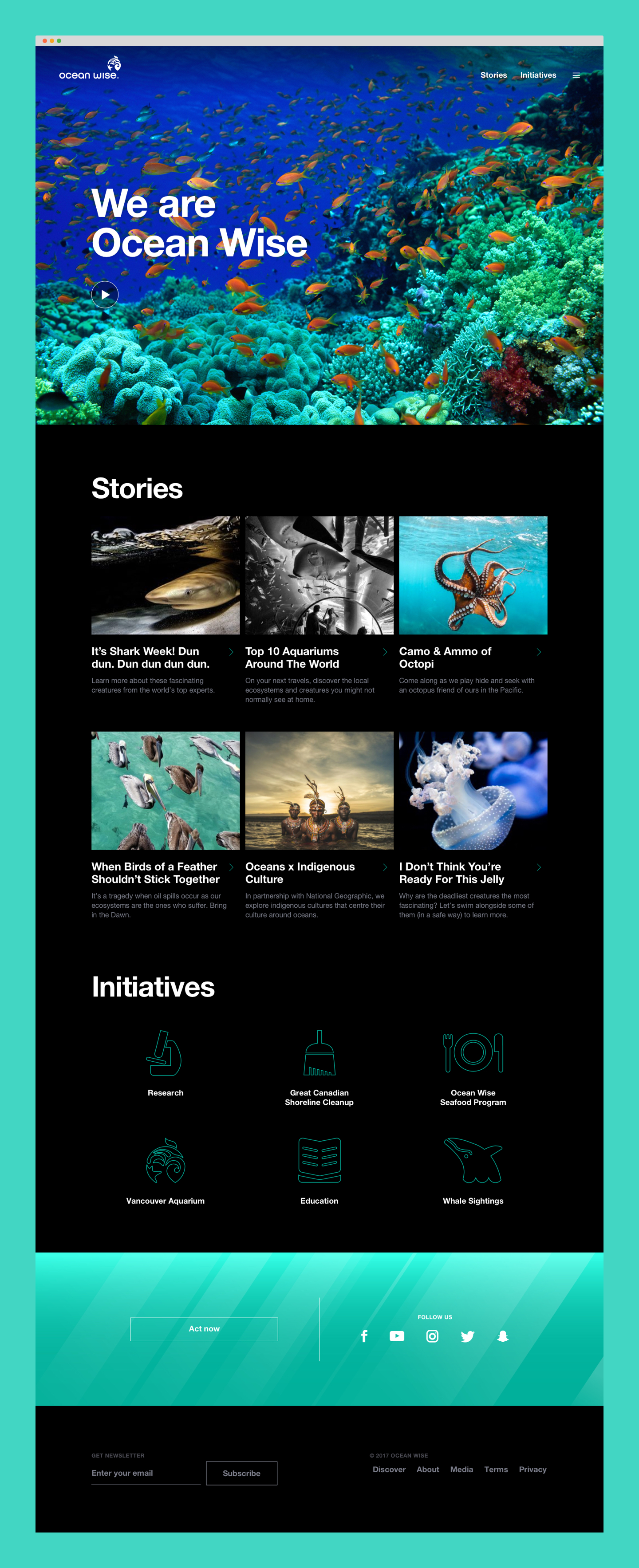
First image is a snippet of the design system we built. Second image is the landing page of Ocean.org at launch.
View other case studies
Power Smart For Schools ✂️A web experience that makes education fun
TuGo 🗺High-level prototyping for the future of travel
Rocky Mountaineer 🚂Service design for luxury travel
Great Canadian Shoreline Cleanup 🚮A digital experience for envrionmentalists IRL